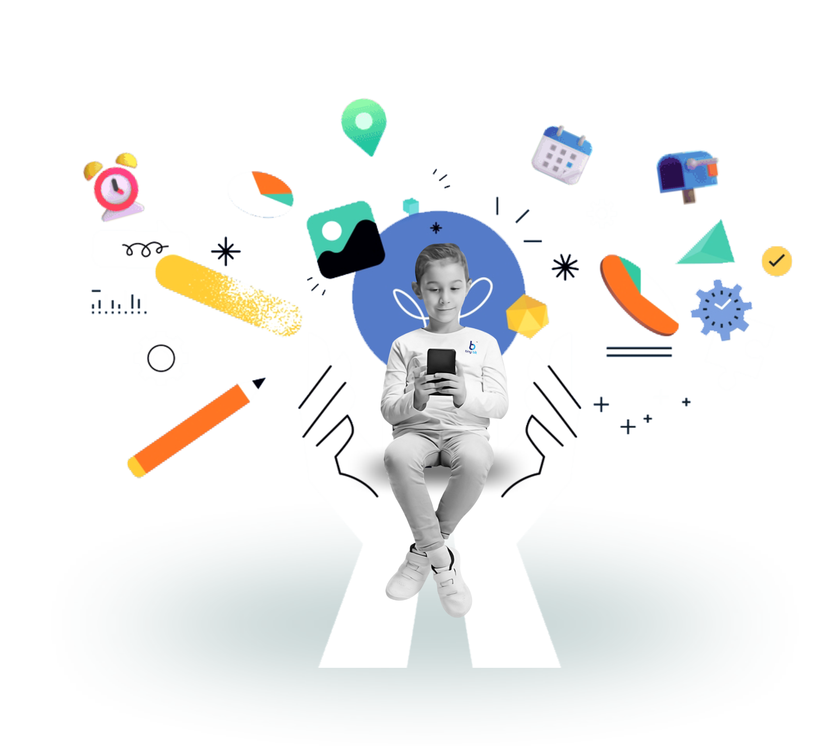
We shape cognitive & intellectual accessibility apps that make learning feel calm and gentle. With soft colors and easy icons, our apps reduce noise and help young minds feel safe.
Our screens are made to feel quiet and steady for children who need less distraction. Bright flashes, loud colors and busy patterns are left out. Instead, we use soft shades, smooth edges and simple shapes. This low distraction look helps children stay with the task in front of them.
A calm screen creates room for clear thought and children can feel less stressed. With this setting, learning becomes easier and daily activities feel less heavy. We always think of young users who may find normal screens too busy. Our apps aim to make the digital world a safe, calm place.
Children learn on many devices today so we made sure our apps work across ios, android and tablets. This means children can start an activity on a phone and later continue on a larger screen without losing their place. Families who share devices can also benefit since the same app works on different platforms.
Teachers in classrooms may use tablets while parents use phones at home yet both can guide the child with the same tools. By making our apps available everywhere we open more doors for children to learn and grow without being tied to just one device.
Our cognitive & intellectual accessibility apps open that door. Try them today and watch how small changes in design can create new ways for children to grow with joy and ease.