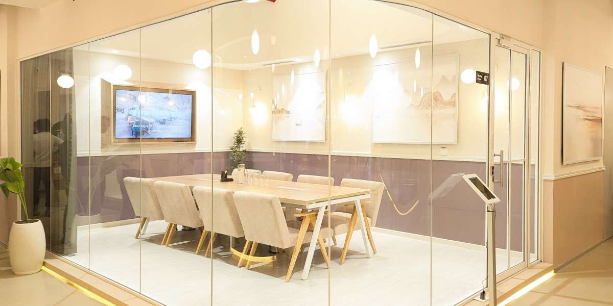
Why Architectural Integration Matters
1. Enhances Brand Cohesion
Your building, interiors, and signage should all speak the same visual language. When they align, your brand feels stronger and more intentional.
2. Improves User Experience
Well-integrated signage doesn’t just look good — it makes spaces easier to navigate. Users intuitively find their way without visual clutter or confusion.
3. Adds Long-Term Value
Architecturally integrated signage is often more durable and timeless, designed to age gracefully with the building itself.
Key Principles of Blending Signage with Architecture
1. Respect the Building’s Style and Materials
Your signage should reflect the architectural style of the space — whether it’s modern, industrial, traditional, or historic.
In a sleek, minimalist environment, opt for clean lines and subtle materials like brushed metal or glass.
For a rustic or natural setting, wood textures or earthy tones might work better.
2. Choose the Right Placement
Signage should feel like a natural extension of the architecture, not an afterthought. Consider:
Recessed signage built into walls
Wayfinding embedded in flooring or etched into surfaces
Suspended or cantilevered signs that mimic architectural lines
3. Use a Cohesive Color Palette
Match signage colors with architectural finishes — such as wall paint, flooring, fixtures, and lighting — to avoid visual conflict and create unity.
4. Select Complementary Materials
Mirror the materials already present in your space. For example:
Use concrete, wood, or stone to match industrial or raw architectural elements.
Match metal finishes to railings, lighting fixtures, or door hardware.
5. Incorporate Lighting Thoughtfully
Lighting can make or break your signage. Use:
Backlit signage for a soft, architectural glow
Spotlights to highlight signs subtly, without overwhelming the design
Natural light to enhance textures and create interplay with shadows
6. Minimize Visual Clutter
Blended signage often uses negative space and minimal typography to maintain visual clarity. Avoid overcrowding and let the sign breathe within the architecture.
Examples of Seamless Integration
Corporate Headquarters: A sleek logo etched into a glass wall at the entrance, echoing the transparency and professionalism of the office design.
Retail Spaces: Hanging signs that follow the rhythm of ceiling beams, maintaining balance while guiding customers.
Hotels or Hospitality: Brass or engraved stone signage embedded directly into wall cladding for a luxurious, seamless finish.
Cultural Institutions: Discreet, modern typography applied directly to stone or concrete surfaces to avoid disrupting the integrity of the architecture.
Collaborating with Architects & Designers
The most successful projects involve early collaboration between signage designers, architects, and interior designers. This allows signage to be part of the overall design conversation — not a last-minute addition.
Ask:
What are the architectural goals of this space?
Which materials are being used?
How can signage be integrated without interrupting sightlines or surfaces?
Final Thoughts
Great signage doesn’t just inform — it enhances. When signage is thoughtfully integrated into architectural design, it contributes to a seamless, immersive experience. It becomes part of the space’s character, not just an accessory.


