In today's digital landscape, users access websites across a plethora of devices, from desktops to tablets and smartphones. To deliver an optimal and seamless experience regardless of the screen size, responsive web design (RWD) has become an essential practice for modern web development.
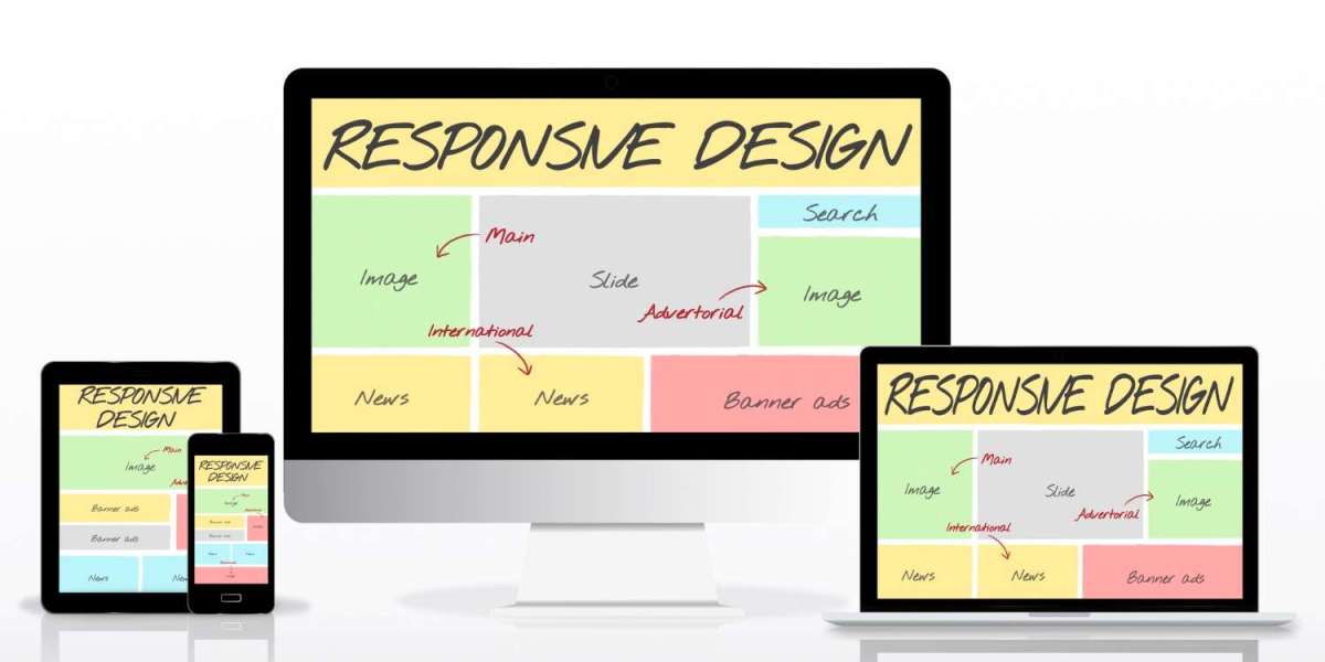
What is responsive web design?
Responsive web design is an approach that builds websites to adapt their layouts, images, and content automatically to fit any screen size or resolution. Instead of creating separate versions for each device, a responsive website uses flexible grids, fluid images, and CSS media queries to create a seamless user experience across devices.
Why is responsive web design crucial?
- Improved User Experience: Responsive design ensures that your website is easy to navigate, read content, and interact with on any device, eliminating the need for zooming or excessive scrolling. This translates to increased user engagement and satisfaction.
- Enhanced SEO Performance: Google prioritizes mobile-friendly websites in search results. A responsive design improves site speed and provides a better user experience, both of which contribute to higher SEO rankings.
- Cost and Time Efficiency: Maintaining a single responsive website is more efficient than managing separate versions for desktop and mobile, reducing development and maintenance costs.
- Increased Reach and Engagement: With a large portion of web traffic originating from mobile devices, a responsive website helps businesses reach a wider audience and enhance engagement by providing an optimal experience on all devices.
- Future-Proofing Your Website: Responsive design prepares your website for future devices and screen sizes, eliminating the need for frequent redesigns or updates.
Key principles and techniques
- Fluid Grids: Instead of using fixed-width layouts, fluid grids use relative units like percentages for widths, allowing elements to resize proportionally and adapt smoothly to different screen sizes.
- Flexible Images: Images and other media elements should scale within their containers without losing quality or distorting the layout.
- CSS Media Queries: Media queries enable you to apply different styles based on the characteristics of the device, such as screen width, height, and orientation. For example, you can adjust font sizes, margins, or layouts for mobile devices.
- Mobile-First Approach: Designing for mobile devices first and then progressively enhancing the experience for larger screens is a recommended practice. This ensures that the core functionality and content are prioritized for smaller screens, leading to faster loading times and a streamlined user experience.
- Prioritize Touch Interactions: Buttons and other interactive elements should be large enough for easy tapping and offer adequate spacing to avoid accidental clicks.
UI/UX Principles for user engagement and responsive design
Responsive web design plays a crucial role in achieving excellent UI/UX Principles for user engagement. A design that adapts seamlessly to different devices inherently follows principles of usability and accessibility. Users are more likely to stay engaged and interact with a website that is easy to navigate and aesthetically pleasing on their chosen device. Key UI/UX principles reinforced by responsive design include:
- Consistency: Maintaining a consistent look and feel across all device types, from fonts and colors to overall layout, reinforces brand identity and user trust.
- Clarity and Simplicity: Especially on smaller screens, a minimalist and clean layout, as described by BrowserStack, improves readability and prevents users from feeling overwhelmed.
- Feedback and Interaction: Responsive elements like buttons with tap feedback or menus with swipe gestures enhance user interaction and satisfaction.
Testing responsive design
Thorough testing is crucial to ensure a seamless experience across devices and browsers. However, testing on real devices or platforms like BrowserStack provides a more accurate assessment of how the website performs in real-world scenarios, identifying layout issues, touch-related problems, and performance bottlenecks.
css
/* Example of a basic media query for responsive styling */
body {
font-size: 16px;
margin: 20px;
}
@media (max-width: 768px) {
body {
font-size: 14px;
margin: 10px;
}
.main-navigation {
display: none; /* Hide desktop navigation on smaller screens */
}
.mobile-menu-toggle {
display: block; /* Show mobile menu icon */
}
}
@media (min-width: 1024px) {
.container {
max-width: 960px;
margin: 0 auto;
}
}
The above code snippet showcases a basic example of how CSS media queries can be used to apply different styles based on screen size. This enables the website to adjust elements like font size and navigation for a better user experience on various devices.
Conclusion
Responsive web design is no longer a luxury but a necessity for businesses aiming to thrive in the digital marketplace. By embracing its principles and techniques, front-end developers can craft multi-device magic, creating websites that adapt seamlessly, enhance user experience, and drive business growth. For expert guidance in building and optimizing responsive websites, consider partnering with experienced professionals. hire front-end developers with expertise in responsive web design to unlock the full potential of your online presence.