Hoardings have long served a dual purpose — protecting construction or renovation sites while offering a large canvas for brand messaging. When designed well, hoarding panels can do more than just cover up a site; they can promote your business, communicate your identity, and reinforce your presence in the public eye.
Aligning your hoarding designs with your corporate brand guidelines is essential if you want to create a strong, consistent image. In this blog, we’ll explore why branding matters on hoardings and how to make sure your designs reflect your business values and visual identity.
Why Corporate Branding Matters on Hoardings
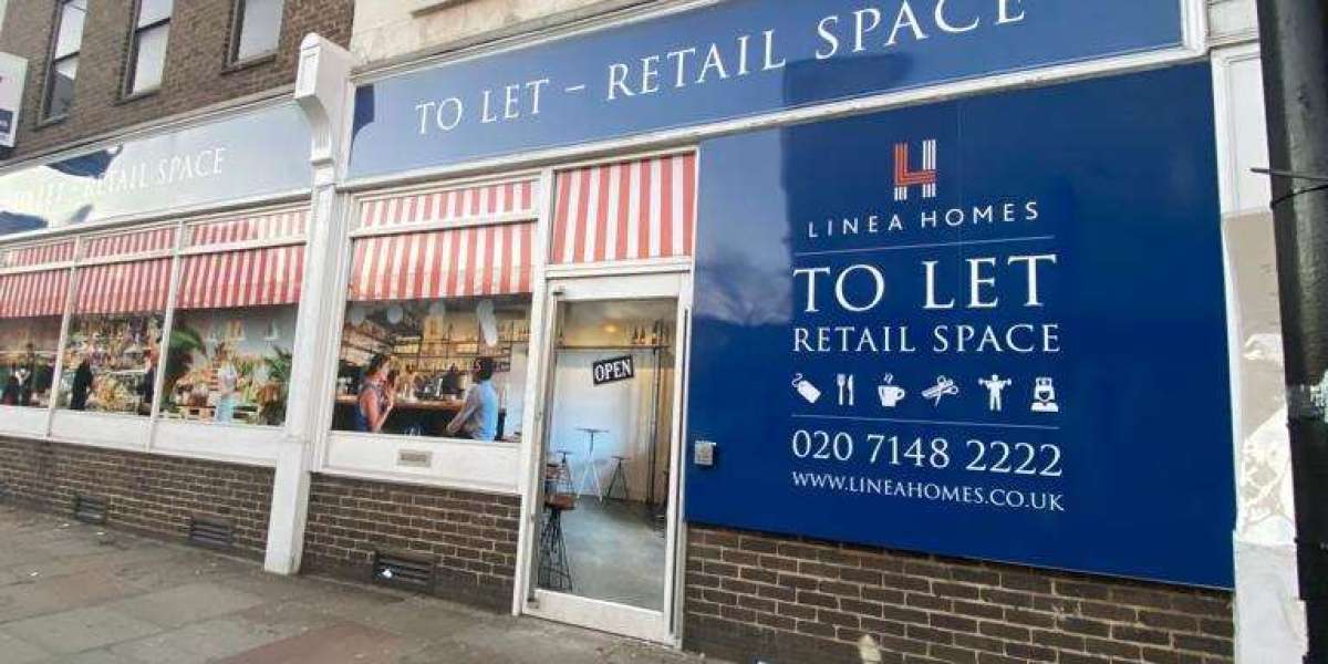
Whether you’re launching a new retail outlet, refurbishing your premises, or developing a property, the hoardings surrounding your site are often the first thing people see. They’re a public statement — not just of what’s happening behind the boards, but of who you are as a company.
A well-branded hoarding makes your business appear professional, organised, and credible. It builds awareness and helps people remember your name. On the other hand, a bland or inconsistent hoarding can give the impression of neglect, missed opportunity, or worse, a lack of identity.
Think of it this way: a plain white panel around your project doesn’t say much about your brand. But hoarding panels printed in your colours, featuring your logo and messaging, turn that empty space into a billboard for your business.
Understanding Corporate Brand Guidelines
Before you begin designing your hoarding panels, it’s important to understand your corporate brand guidelines. These are the rules that define how your brand should look and feel, across all touchpoints — including digital, print, packaging, and of course, hoardings.
Key elements of a brand guideline include:
- Logos and how to use them
- Corporate colour palette
- Typography and font usage
- Imagery and photography style
- Tone of voice and messaging rules
The challenge is to apply these guidelines in a way that works on large-scale formats like hoardings. What looks good on a business card or brochure might not translate directly to a hoarding panel unless it's adjusted for size, visibility, and environment.
Planning Your Hoarding Design Strategy
A successful hoarding design begins with careful planning. This stage is where your creative ideas meet the practical needs of the project site. Here are a few points to consider:
1. Know Your Space
Measure your site accurately and understand where each hoarding panel will be placed. Consider visibility from different angles and distances, especially from roads and walkways.
2. Understand Your Audience
Who will see your hoardings? Are you trying to attract local foot traffic, investors, or potential tenants? Knowing your audience will help shape your message and design.
3. Work as a Team
Involve both your branding team and your construction or site team. Designers will understand brand consistency, while site managers will know the practical limits of the space.
4. Material and Finish
Choose materials that suit the environment and weather conditions. Matte, gloss, anti-graffiti and UV-resistant finishes can improve durability and presentation.
Planning ahead means fewer surprises down the line, and it increases the chances of producing a hoarding that’s visually effective and true to your brand.
Key Elements of Brand-Aligned Hoarding Designs
Once the planning is complete, it’s time to bring your brand to life on your hoarding panels. Here’s how to do it:
Logo Placement and Size
Your logo must be clearly visible. Avoid placing it too close to edges, or at heights where it might be obscured. Make sure the scale suits the distance from which people will view it.
Corporate Colours
Always use official brand colours, and check with your printer to ensure colour accuracy in large-scale printing. Slight variations in colour can make your design look inconsistent or unprofessional.
Typography
Fonts should follow your brand guidelines, but also be legible from a distance. Avoid thin or overly decorative typefaces. Stick to high-contrast text for important messages.
Imagery
Use high-resolution images that reflect your brand identity. For example, a luxury development might use sleek architectural renders, while a community-focused business might opt for friendly, people-centric imagery.
Message Tone
Make sure the words on your hoardings reflect your company’s voice. Whether that’s formal, casual, bold or warm, consistency is key. Use slogans, taglines, or mission statements that already exist in your brand messaging.
Call to Action
Invite people to visit your website, follow your social media, or stay tuned for updates. Make this information easy to read and remember, without overpowering the main branding.
Common Mistakes to Avoid
It’s easy to make errors that can dilute your brand or reduce the effectiveness of your hoarding panels. Here are a few to watch out for:
- Poor resolution images – These can look pixelated or blurry when scaled up.
- Incorrect colour usage – Not matching brand colours can make your hoardings feel disconnected.
- Over-cluttered layouts – Too much text or too many elements distract from the main message.
- Ignoring safe zones – Important content placed too close to panel joins or the ground may be missed entirely.
A clean, clear design with strong branding will always outperform a chaotic one.

Case Study Example
Let’s say a nationwide retail chain is refurbishing one of its high street stores. Instead of plain timber hoardings, they use printed hoarding panels that display their iconic logo, a bright colour scheme, and the tagline: "Something exciting is coming."
Locals walking by immediately recognise the brand and feel a sense of anticipation. This simple move keeps the brand top-of-mind even when the store is closed. That’s the power of aligning hoardings with corporate branding.
Final Checklist Before Printing
Before sending your hoarding designs off for production, run through this final checklist:
- Are all logos high resolution and correctly placed?
- Do the colours match your brand’s official palette?
- Is the text large enough to be read from a distance?
- Have you proof-checked all spelling, grammar, and brand-specific wording?
- Did someone from your brand team sign off on the design?
- Have you cross-checked dimensions with your print provider and site manager?
Double-checking these items can prevent costly mistakes and delays.
Conclusion
Aligning your hoarding designs with your corporate brand guidelines isn’t just a creative task — it’s a strategic one. From visual identity to messaging tone, every element should reflect who you are as a business. Hoarding panels aren’t just temporary structures; they’re part of your brand experience.
By putting care into the design and planning of your hoardings, you not only beautify your site but also build brand awareness, trust, and professionalism.
For companies looking to make an impact, the Hoarding Print Company offers expert guidance and production for fully branded hoarding panels that match your unique identity and needs.